
I have already tried to delete the network lines, and I -really- didn't like it, it looked just awful IMHO. I don't want to make something that I don't like, do you?
Add the earth to each icon: why? Because without it, they look totally empty around them, or "not finished". Look here: http://forum.freegamedev.net/viewtopic.php?f=18&t=4541#p47647. I could eventually turn or give a bigger size to some elements, (notif button for example), but they look empty then. Obviously I cannot add so much details to a closed letter...
Another reason is that we are on online play screen, and a same basis for every icon seems to me a good idea.
About tux with his cap; I really really like it. You might like or not, but feel free to give constructive proposals. I mean, something else than simply removing what you don't like.
I won't bring a cap-only icon because:
Imagine I make it; someone else (X) says he prefers a green cap, I make it, then Y wants me to add a shadow, then you say that you prefer the red one, then 3 people (Z,A and B) make a petition to have a head in the cap, and my minds blews up because I liked the starting point.
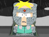
Another thing (ok it's a joke): someone very important (in the racing world) uses this cap, so Tux (who is very important in STK and to me) must do the same.
Proof here:

"I really like my super cap!"
- Michael. S.
@ uni: create server update:


 Friends
 Achievements
 Overview (? Need to be tested in game...)
 Profile
 Sign In
 Sign Out

