
FreeGameDev Forums < STK Contributions
Models, tracks, sound, music and more for STK.
Moderator: STK Moderators
105 posts
• Page 3 of 5 • 1, 2, 3, 4, 5
New HUD design
Re: New HUD design
![]() by Totoplus62 » 19 Apr 2013, 00:01
by Totoplus62 » 19 Apr 2013, 00:01
If hiker or auria think this is a good idea (and i think so !  ), i will create a ticket for that
"Imagination is more important than knowledge." Features under CC-BY 3.0, CC-BY-SA 3.0 or equivalent GNU license
 SuperTuxKart Popularity
SuperTuxKart Popularity-

Totoplus62 - Posts: 584
- Joined: 10 Nov 2012, 13:33
- Location: France - Pas-de-Calais
Re: New HUD design
![]() by Auria » 21 Apr 2013, 18:38
by Auria » 21 Apr 2013, 18:38
This is not a bad idea, a ticket could be created; but please give it a low priority

-

Auria - STK Moderator
- Posts: 2976
- Joined: 07 Dec 2009, 03:52
Re: New HUD design
![]() by Totoplus62 » 21 Apr 2013, 23:34
by Totoplus62 » 21 Apr 2013, 23:34
Auria {l Wrote}:This is not a bad idea, a ticket could be created; but please give it a low priority
Ok
"Imagination is more important than knowledge." Features under CC-BY 3.0, CC-BY-SA 3.0 or equivalent GNU license
SuperTuxKart Popularity
SuperTuxKart Popularity-
Totoplus62 - Posts: 584
- Joined: 10 Nov 2012, 13:33
- Location: France - Pas-de-Calais
Re: New HUD design
![]() by hiker » 23 Apr 2013, 14:23
by hiker » 23 Apr 2013, 14:23
Totoplus62 {l Wrote}:Auria {l Wrote}:This is not a bad idea, a ticket could be created; but please give it a low priority
Ok
Done in r12690 - feedback welcome!
Thanks!
Joerg
- hiker
- Posts: 1435
- Joined: 07 Dec 2009, 12:15
- Location: Melbourne, Australia
Re: New HUD design
![]() by samuncle » 23 Apr 2013, 21:55
by samuncle » 23 Apr 2013, 21:55
I like this little effect. I have add a nice blur arround. IMHO it's better now.
I suggest to add the same effect when you use a zipper but for the speedometer.
I suggest to add the same effect when you use a zipper but for the speedometer.

-

samuncle - STK Moderator
- Posts: 754
- Joined: 16 Mar 2010, 21:28
Re: New HUD design
![]() by Totoplus62 » 23 Apr 2013, 23:47
by Totoplus62 » 23 Apr 2013, 23:47
samuncle {l Wrote}:I suggest to add the same effect when you use a zipper but for the speedometer.
+1
Nice idea samuncle !
"Imagination is more important than knowledge." Features under CC-BY 3.0, CC-BY-SA 3.0 or equivalent GNU license
SuperTuxKart Popularity
SuperTuxKart Popularity-
Totoplus62 - Posts: 584
- Joined: 10 Nov 2012, 13:33
- Location: France - Pas-de-Calais
Re: New HUD design
![]() by tavariz91 » 24 Apr 2013, 15:18
by tavariz91 » 24 Apr 2013, 15:18
As we are here, Why not the same for throwing things... I mean, If you have three objects, you throw one, you get a blur around them and the thrown object is removed from the list.
(Must be less than 0.5 second effect)
I have not tried to compile the version with the blur effect et, but I'll try tonight.
(Must be less than 0.5 second effect)
I have not tried to compile the version with the blur effect et, but I'll try tonight.
"I do not agree with what you say, but I will fight up to death so that you have the right to say it"
- Voltaire
- Voltaire
-
tavariz91 - Posts: 146
- Joined: 03 Apr 2013, 11:22
- Location: Lausanne, in my Sweet Zerland
Re: New HUD design
![]() by Totoplus62 » 18 May 2013, 22:23
by Totoplus62 » 18 May 2013, 22:23
Next step with Hud: Frame for Weapon
I made this because in STK there is no border for weapons at all, this is a bit weird and maybe make people that never played STK think this game is cheap (?)
This is an illustration -->
This design permit to "divide" the frame into two parts (left and right) so it can be automaticaly adapted to the number of item
What do you think of it ?
Sorry i did not play with nightly build so there is not the new speedometer ^^
I made this because in STK there is no border for weapons at all, this is a bit weird and maybe make people that never played STK think this game is cheap (?)
This is an illustration -->

This design permit to "divide" the frame into two parts (left and right) so it can be automaticaly adapted to the number of item
What do you think of it ?
Sorry i did not play with nightly build so there is not the new speedometer ^^
"Imagination is more important than knowledge." Features under CC-BY 3.0, CC-BY-SA 3.0 or equivalent GNU license
SuperTuxKart Popularity
SuperTuxKart Popularity-
Totoplus62 - Posts: 584
- Joined: 10 Nov 2012, 13:33
- Location: France - Pas-de-Calais
Re: New HUD design
![]() by rubberduck » 19 May 2013, 18:44
by rubberduck » 19 May 2013, 18:44
i think that is good, but when you have more than 5 weapons, there should be a number that shows your count
this often is a problem, when driving time-mode(because you get x zippers in x rounds, when more than 5 rounds
this often is a problem, when driving time-mode(because you get x zippers in x rounds, when more than 5 rounds
https://notabug.org/rbduck/Nucleagacy
my puzzle / action game in godot 4
my puzzle / action game in godot 4
-

rubberduck - Posts: 910
- Joined: 23 Apr 2013, 18:31
- Location: sitting with tux in a bathtub
Re: New HUD design
![]() by Auria » 20 May 2013, 17:04
by Auria » 20 May 2013, 17:04
Totoplus, I like the idea, if you can somehow incorporate Rubberduck's idea it would be great!
-
Auria - STK Moderator
- Posts: 2976
- Joined: 07 Dec 2009, 03:52
Re: New HUD design
![]() by Totoplus62 » 20 May 2013, 21:57
by Totoplus62 » 20 May 2013, 21:57
Ok so a number when there are more than 5 weapon (because this system + number may redundant), but i'm not a coder  so i don't see how I can incorporate this.
I will think about a "graphical" alternative.
Nb: i have some internet problems so i'm looking at this as soon as possible
I will think about a "graphical" alternative.
Nb: i have some internet problems so i'm looking at this as soon as possible
"Imagination is more important than knowledge." Features under CC-BY 3.0, CC-BY-SA 3.0 or equivalent GNU license
SuperTuxKart Popularity
SuperTuxKart Popularity-
Totoplus62 - Posts: 584
- Joined: 10 Nov 2012, 13:33
- Location: France - Pas-de-Calais
Re: New HUD design
![]() by Arthur » 20 May 2013, 22:44
by Arthur » 20 May 2013, 22:44
I am not sure if we need it at all... current proposed weapons border is too prominent in my opinion.
Hey pal, I took an oath for justice! "In happy days or tightest tights..." or something like that.
-

Arthur - Posts: 1073
- Joined: 06 Dec 2009, 00:49
Re: New HUD design
![]() by Totoplus62 » 21 May 2013, 10:03
by Totoplus62 » 21 May 2013, 10:03
We really need something around weapon IMHO i can make them look smaller, play with opacity, color etc... that was a test
Then we can also change the size of weapon icons
Then we can also change the size of weapon icons
"Imagination is more important than knowledge." Features under CC-BY 3.0, CC-BY-SA 3.0 or equivalent GNU license
SuperTuxKart Popularity
SuperTuxKart Popularity-
Totoplus62 - Posts: 584
- Joined: 10 Nov 2012, 13:33
- Location: France - Pas-de-Calais
Re: New HUD design
![]() by Totoplus62 » 05 Dec 2013, 16:25
by Totoplus62 » 05 Dec 2013, 16:25
Hi,
I worked again on the weapons border and tried several things, we should really try to avoid the current "line" of weapons without anything ; every karting game have something like this:
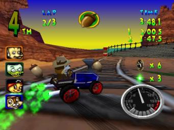
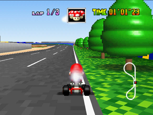
Here are few examples:
http://mariofusion.free.fr/jeux/mario_k ... een-01.jpg
http://cdn1.spong.com/screen-shot/w/a/w ... r-PC-_.jpg
http://photo.europe1.fr/infos/high-tech ... th_630.png
http://www.theisozone.com/images/screen ... 193771.jpg
http://www.mariomayhem.com/consoles/64/ ... t_64-1.jpg
http://a2.mzstatic.com/eu/r30/Purple/v4 ... 0x480.jpeg lol
Here is the result (of course we can change the size, modify, etc...)

What do you think about it ?
This also means that we should have a limitation for weapons (You can't have more than 3 of the same item at the same time for example. This is already the case for more than 90% of karting games)
I worked again on the weapons border and tried several things, we should really try to avoid the current "line" of weapons without anything
Here are few examples:
http://mariofusion.free.fr/jeux/mario_k ... een-01.jpg
http://cdn1.spong.com/screen-shot/w/a/w ... r-PC-_.jpg
http://photo.europe1.fr/infos/high-tech ... th_630.png
http://www.theisozone.com/images/screen ... 193771.jpg
http://www.mariomayhem.com/consoles/64/ ... t_64-1.jpg
http://a2.mzstatic.com/eu/r30/Purple/v4 ... 0x480.jpeg lol
Here is the result

What do you think about it ?
This also means that we should have a limitation for weapons (You can't have more than 3 of the same item at the same time for example. This is already the case for more than 90% of karting games)
Last edited by Totoplus62 on 05 Dec 2013, 16:58, edited 2 times in total.
"Imagination is more important than knowledge." Features under CC-BY 3.0, CC-BY-SA 3.0 or equivalent GNU license
SuperTuxKart Popularity
SuperTuxKart Popularity-
Totoplus62 - Posts: 584
- Joined: 10 Nov 2012, 13:33
- Location: France - Pas-de-Calais
Re: New HUD design
![]() by SuperMat » 05 Dec 2013, 16:44
by SuperMat » 05 Dec 2013, 16:44
That's a really cool idea . You could make an ellipse instead of a circle so that 5 weapons fit into it. (Or maybe animate the circle to an ellipse if the player gets 4 or 5 weapons) 
OS: Arch Linux/OS X Yosemite (10.10)
IRC: mt/mteufel @ freenode
IRC: mt/mteufel @ freenode
- SuperMat
- Posts: 51
- Joined: 20 Jan 2012, 19:19
- Location: /home/mteufel
Re: New HUD design
![]() by Arthur » 05 Dec 2013, 17:34
by Arthur » 05 Dec 2013, 17:34
Finally a HUD proposal I think looks good. Here, have my approval.
Hey pal, I took an oath for justice! "In happy days or tightest tights..." or something like that.
-
Arthur - Posts: 1073
- Joined: 06 Dec 2009, 00:49
Re: New HUD design
![]() by Uni » 05 Dec 2013, 20:04
by Uni » 05 Dec 2013, 20:04
This way it takes up a lot of space.. then some moving around should be done
-

Uni - Posts: 72
- Joined: 04 May 2013, 01:53
Re: New HUD design
![]() by Totoplus62 » 05 Dec 2013, 21:05
by Totoplus62 » 05 Dec 2013, 21:05
Yes we can reduce the size while remaining readable.
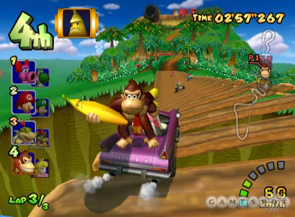
If people want to do some moving around: the organization of MK double dash GUI is really interesting imho
-> http://images1.fanpop.com/images/image_ ... 08_448.jpg
(I hope the final step: Ranking with big numbers will be done in the future)
If people want to do some moving around: the organization of MK double dash GUI is really interesting imho
-> http://images1.fanpop.com/images/image_ ... 08_448.jpg
(I hope the final step: Ranking with big numbers will be done in the future)
"Imagination is more important than knowledge." Features under CC-BY 3.0, CC-BY-SA 3.0 or equivalent GNU license
SuperTuxKart Popularity
SuperTuxKart Popularity-
Totoplus62 - Posts: 584
- Joined: 10 Nov 2012, 13:33
- Location: France - Pas-de-Calais
Re: New HUD design
![]() by GunChleoc » 06 Dec 2013, 18:46
by GunChleoc » 06 Dec 2013, 18:46
The game tends toward rounded shapes, so if squared, it will need rounded edges at least IMHO.
-

GunChleoc - Posts: 502
- Joined: 20 Sep 2012, 22:45
Re: New HUD design
![]() by Funto » 08 Dec 2013, 09:13
by Funto » 08 Dec 2013, 09:13
I imagined it with roughed edges (forgot to precise, sorry).
It would be just a quick test to get an opinion, maybe totally rounded is better.
It would be just a quick test to get an opinion, maybe totally rounded is better.
- Funto
- Posts: 459
- Joined: 09 Dec 2009, 13:47
- Location: Bordeaux, France
Re: New HUD design
![]() by Totoplus62 » 08 Dec 2013, 15:30
by Totoplus62 » 08 Dec 2013, 15:30
Ok funto i will try this soon even if i also think a circle is better
"Imagination is more important than knowledge." Features under CC-BY 3.0, CC-BY-SA 3.0 or equivalent GNU license
SuperTuxKart Popularity
SuperTuxKart Popularity-
Totoplus62 - Posts: 584
- Joined: 10 Nov 2012, 13:33
- Location: France - Pas-de-Calais
Re: New HUD design
![]() by Arthur » 09 Dec 2013, 01:01
by Arthur » 09 Dec 2013, 01:01
I am also thinking the circle looks fine, but sure, try other options too if you have time.
Hey pal, I took an oath for justice! "In happy days or tightest tights..." or something like that.
-
Arthur - Posts: 1073
- Joined: 06 Dec 2009, 00:49
Re: New HUD design
![]() by Totoplus62 » 04 Mar 2014, 23:20
by Totoplus62 » 04 Mar 2014, 23:20
Hi,
Here is a very quick test with a squared version as funto suggested

I prefer the circle version.
I have questions:
What kind of resolution should I use? Current items use the 128*128 resolution (maybe this is too small).
If i use a bigger resolution, i will work on some weapon icons again. It will take more time.
I also think we should find something else for zipper icon that currently represents nothing. Any ideas ?
"Imagination is more important than knowledge." Features under CC-BY 3.0, CC-BY-SA 3.0 or equivalent GNU license
SuperTuxKart Popularity
SuperTuxKart Popularity-
Totoplus62 - Posts: 584
- Joined: 10 Nov 2012, 13:33
- Location: France - Pas-de-Calais
Re: New HUD design
![]() by Auria » 05 Mar 2014, 00:33
by Auria » 05 Mar 2014, 00:33
Both circle and square look nice, I'm just not yet fully convinced they're necessary - perhaps they even attract a bit more attention than they should? Maybe other people can share opinions?
-
Auria - STK Moderator
- Posts: 2976
- Joined: 07 Dec 2009, 03:52
105 posts
• Page 3 of 5 • 1, 2, 3, 4, 5
Who is online
Users browsing this forum: No registered users and 1 guest