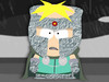
Auria {l Wrote}:I would add to the guidlines : thick outlines. Many people who try to make icons make the mistake of using thin outlines, while they need to be quite thick
samuncle {l Wrote}:Hum I prefer the original one. And you forgot the eyes (also in the guidelines). They have all the same eye texture.
Maybe like ludsky's version but a bit more professional .
fraang {l Wrote}:samuncle {l Wrote}:Hum I prefer the original one. And you forgot the eyes (also in the guidelines). They have all the same eye texture.
Maybe like ludsky's version but a bit more professional .
What do you think of version 3? See post above.
Uni {l Wrote}:fraang {l Wrote}:samuncle {l Wrote}:Hum I prefer the original one. And you forgot the eyes (also in the guidelines). They have all the same eye texture.
Maybe like ludsky's version but a bit more professional .
What do you think of version 3? See post above.
Position the eyes more horizontally, and I think we have a winner.
Ludsky {l Wrote}:Other Icon for XFCE's
fraang {l Wrote}:Ludsky {l Wrote}:Other Icon for XFCE's
I would recommend you to make your icons using a vector graphics program like Inkscape. You will get much cleaner lines and are able to tinker with it more easily. If you need help or advice using it just ask.
I have uploaded a Inkscape SVG file with preconfigured grid: http://www.sendspace.com/file/n45425
fraang {l Wrote}:colors
- Don't use color gradients
Totoplus62 {l Wrote}:This is nice Ludsky .
I've made a version which is 256*256 (It looks like vectorial, it feels like vectorial, it is not: i'm good with gimp not Inkscape ^^)
128*128fraang {l Wrote}:colors
- Don't use color gradients
This rule isn't a good idea imho , some icons already have gradients.
We should add the rule: All the icons have the same type of eyes.
For sara, betharatux just have to change the eyes. I don't have the original svg file to do it.
Users browsing this forum: Bing [Bot] and 1 guest