
Before starting this post, if you're a dev of STK I would like you to calm down because this is post is mostly going to be about complains about the game and "you've done this wrong" stuffs.
I have to admit that I don't know a lot about STK's background. I don't know how old the project is and if has been taken back to life from another old project but I do know one very important thing : STK is heading right in the direction of "theses regular open-source games", which means poor design, poor gamplay but thanks god the source is open so that automatically made it a must have.
Ever played SuperTux not because you wanted to be it actually was the only game available on your computer that came with your Linux distro ? That's what STK is going to be in a near future.
The reason why I'm writing this post is not because I'm an angry guy who have some free time to loose ; but because I actually like the idea of at last having (we, the linux users/free games addicts in general) our own Super Mario Kart clone and I actually spend time playing the last release of STK from time to time and I would like STK to become a "Good Game" and not just an "Open-Source Game".
Therefore as a player who like your game the best thing I can do if I can't contribute to the project by coding for it would be at least to honnestly point out what's seriously wrong and need to be changed.
Ok, this in not going to be an easy post for me to write because there's a lot of things to complain and talk about.
First things firt : The Menu
There's only one word that can descrite the whole game : overloaded. And this starts with the menu.
First of all, when I start the game, there's this strange loading screen with heads of all the characters filling the bottom of the screen.
What's wrong with the regular black screen and white loading bar ?
That may sounds stupid, but I wanted to play a video game, not to start up KDE.
I can't say the startup menu is especially bad, but it's especially empty if we compare it to what some other racing games looks like.
The Help and Quit buttons seems a bit unappropriate.
The Quit button could be simply removed since the software quit when you hit the Escape key or be put in one of the bottom corner of he screen and smaller.
The Help button could be completely removed and replaced by a real PDF manual downloadable on the website. Or it could depend way less on the GUI to make it more readable.
Let's talk a bit more about the GUI in a section where it became even more important : the Option panel
Before talking about how ugly the GUI is, let's talk about how uglier it could be. One of the thing that really caught my eye is the ability to change the "skin" of it.
Seriously, how useless it that ? The skin of the menu doesn't have to be the choice of the player but it has to be the player doesn't have to care about (and doesn't complain about of course).
I really don't know if this "feature" is planned to be kept, but for now it only give you the choice between 2 and half differen't skins (3 actually, but it's only a color change for one of it) the worst of all being the skin "glass" which only reminds me an old bottle of wine.
The resolution change menu is quite obviously uncomplete but also really overloaded with all theses icons of screen telling the ratio of the resolution while all of this could have been reduced to a simple menu with two arrows on each side... which is ironically how the skin menu is working.
Also one last thing that will pop-up again once I'll start playing is the font used.
I don't know if it's because it looked cool or if it's because it was open to use for anything but this font is cleary too detailed for menu.
Everything is already graphically overloaded, don't make it heavier with a complex font.
Go ahead and use a clean font that won't make all of this hard to read.
Again, just like the other guys are doing.
Ok that's maybe enoug about the menu for now. There sure is a lot of things to complain about again for the race menu about how empty it is and how it doesn't wisely use the space of the screen but it's time to play.
The characters
There's two big problems with the playable characters of this game.
First of all, I do understand this game is about open-source mascot racing with each other but this is no excuse for the lack of creativity in the making of the models.
The characters really looks too much like the logo drawing we're used to see ; as a matter of fact, Pidgin looks like he got a piece of broken glass stucked in the butt and Wilber looks like he have been beaten with the ugly stick.
Making characters that are "inspired by" and not "exact reproduction of" would have been a better idea.
Another bad thing is that every character got their own cars.
I'm going to be nice this time, I'm sure it's a decision taken because it's hard to make different cars and characters, blablabla. But this has a serious impact on the gameplay as no cars can have specific features because they're stucked to one character's butt. Or if it is, what if I want to race Hexley and being forced to have a less efficient car than Tux who certainly will beat the crap out of me ?
This is probably where the biggest of the work will be.
Now it's time to choose my track and things aren't getting any better.
The track choosing menu is very confusing.
First of all this line of tracks at the top of the scree which can't stop changing every 2seconds is really annoying.
Second, it get very difficult to choose a race when you have the screenshot of the tracks first and the name of it after.
This clearly should be the contrary, with the list of the names of the track and the screenshot displaying only when selected.
Also, the screenshots of the maps doesn't represent at all the track that we're going to race. It's just a simple in-game screenshot with the player filling approximatively 1/9 of the small image. The tracks seriously have to be shot without any players and from a very different angle that can give a very distinctive view of it.
Okay, time to play (btw, that "follow the 1st one mode" is the weirdest idea ever)
Now that the real game started there's already a lot of bad points to... well point out.
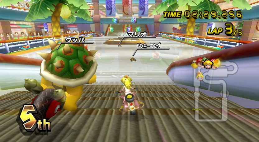
Let's grab a regular Mario Kart Wii screenshot and compare the on-screen informations
Super Mario Kart
- Time (not super usefull for regulat playing, I agree)
Laps
Rank
Readable Map (with position of the players)
Bonus (when grabbing a bonus)
Super Tux Kart
- Time
Laps
Rank
Tinyest map ever (with position of the players but impossible to see)
Position of the players
Nitro counter
Speed
Bonus (when grabbing a bonus)
Informations about other players
There's no need to be a genius to understand that there's clearly too much things on the screen when playing STK.
In the first place, the Speed indicator is useless. The player doesn't need to know at what speed he's driving since you can clearly feel when a bonus/malus is making you faster/slower. Instead of trying to improve the unimprovable, try to see what's needed and what is not.
The position of the players on the left side of the screen come from a good idea and starts to be a serious pain when you have more than 6 players in the race as it can't stop wobbling up and down because everyone is driving side to side.
This feature should also be removed in favor of a bigger map that'll give the same amount of information but in a less annoying way.
Talking about information : theses little lines at the bottom of the screen telling you what have the other players done is really unwanted and belongs to games such as Worms, Hedgewars, Wormux but not to a game where you're supposed to be focused on the track you're driving on.
There's one thing that bothers me with this nitro counter is that it add more complexity to the game. You already have to focus on the track, avoid traps and attack your ennemies. Why making the game more complex by adding nitro bonus that you have to focus to catch and then hit the "N" key to have a little boost not efficient enought to win the race ?
Maybe that was a good idea, but that not really is the right way to implement it.
If you really need a boost thinggy, why not doing an automatic one exactly like in the game Ignition/Fun Tracks ?
The car's speed is a real problem as it isn't uncommon to be on a track and keep the same distance between two players for a long time because of not grabbing the right bonus or not having enough nitro.
The obtained bonus shouldn't appear as an alone logo at the top of the screen but should be inside a container... like the others guy do.
Another problem would be bonus keeping as it is annoying to grab a bonus and then having it switched by another one it you accidently grab another bonus while still haven't used the precendent one.
And once again, a clean font should be used rather than a quircky one.
I think that's all for now, others suggestions, ideas and such may pop up.
Please don't act as if I was a mean person. I may was rude but I think STK deserve to be a very good game instead of being that "I contributed to this project" thinggy you put on your CV.
Please let me know what do you think about it, don't hesitate to point out my mistakes.
Arguing by saying "You mispelled this" or "If you're so smart join the team and help us" and such won't make the game any better.


