
FreeGameDev Forums < STK Contributions
Models, tracks, sound, music and more for STK.
Moderator: STK Moderators
New HUD design
Re: New HUD design
![]() by ctdabomb » 05 Mar 2014, 13:26
by ctdabomb » 05 Mar 2014, 13:26
- ctdabomb
- Posts: 1075
- Joined: 13 Dec 2011, 21:21
- Location: halfway there
Re: New HUD design
![]() by GunChleoc » 05 Mar 2014, 13:37
by GunChleoc » 05 Mar 2014, 13:37
-

GunChleoc - Posts: 502
- Joined: 20 Sep 2012, 22:45
Re: New HUD design
![]() by Totoplus62 » 05 Mar 2014, 14:47
by Totoplus62 » 05 Mar 2014, 14:47
Auria {l Wrote}:Both circle and square look nice, I'm just not yet fully convinced they're necessary - perhaps they even attract a bit more attention than they should? Maybe other people can share opinions?
The border on the square version is too prominent/big (but that was just an example), the circle is better -->

To be honest i don't really understand why people want to keep weapons without a border or anything around them
But feel free to share ideas, criticisms etc
ctdabomb {l Wrote}: Maybe instead of a box around it, how a line/thinner box go behind it? just an idea.
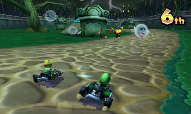
@ctdabomb: Like mario kart wii ? --> http://mariofusion.free.fr/jeux/mario_k ... een-01.jpg
 SuperTuxKart Popularity
-

Totoplus62 - Posts: 584
- Joined: 10 Nov 2012, 13:33
- Location: France - Pas-de-Calais
Re: New HUD design
![]() by ctdabomb » 07 Mar 2014, 00:26
by ctdabomb » 07 Mar 2014, 00:26
- Attachments
-
- ctdabomb
- Posts: 1075
- Joined: 13 Dec 2011, 21:21
- Location: halfway there
Re: New HUD design
![]() by Totoplus62 » 08 Mar 2014, 20:02
by Totoplus62 » 08 Mar 2014, 20:02
I'm not sure I understood everything of your idea.
It looks weird this way.
SuperTuxKart Popularity-
Totoplus62 - Posts: 584
- Joined: 10 Nov 2012, 13:33
- Location: France - Pas-de-Calais
Re: New HUD design
![]() by sphyrth » 12 Mar 2014, 05:16
by sphyrth » 12 Mar 2014, 05:16
Having a number on the bottom right "corner"(?) of the border does seem to look much better, and it makes sense considering that it is a circle.
You only have to think of ways to make that border have a "cartoony" feel to it.
- sphyrth
- Posts: 16
- Joined: 30 Nov 2013, 02:34
Re: New HUD design
![]() by Totoplus62 » 15 Mar 2014, 20:22
by Totoplus62 » 15 Mar 2014, 20:22
sphyrth {l Wrote}:Having a number on the bottom right "corner"(?) of the border does seem to look much better, and it makes sense considering that it is a circle.
I don't know if this is better to have a number like this but this will be ugly with the current font. I think this is better to have different images for one, two or three items like this example imho
SuperTuxKart Popularity-
Totoplus62 - Posts: 584
- Joined: 10 Nov 2012, 13:33
- Location: France - Pas-de-Calais
Re: New HUD design
![]() by Auria » 15 Mar 2014, 20:34
by Auria » 15 Mar 2014, 20:34

-

Auria - STK Moderator
- Posts: 2976
- Joined: 07 Dec 2009, 03:52
Re: New HUD design
![]() by Totoplus62 » 16 Mar 2014, 14:11
by Totoplus62 » 16 Mar 2014, 14:11
sphyrth {l Wrote}:You only have to think of ways to make that border have a "cartoony" feel to it.
Auria {l Wrote}:the style is not consistent with the speedometer. Perhaps you can come up with something a little more subtle, that is consistent with the rest of the race GUI? We should try to make the race GUI more consistent. The speedometer does not have thick borders, so I don't think the items should, either
Ok, here is a complete new approach without borders, more "cartoony" and unseen in a karting game:

Cookie clicker inspired me: http://orteil.dashnet.org/cookieclicker/
Please note that:
This is an unfinished version, so we can:
- change the transparency/opacity (this has to be more subtle)
-change the rotation speed (it has to be very slow)
-change the size
-add a darker background
-add several layers
-change everything
etc...
Share your ideas
SuperTuxKart Popularity-
Totoplus62 - Posts: 584
- Joined: 10 Nov 2012, 13:33
- Location: France - Pas-de-Calais
Re: New HUD design
![]() by GunChleoc » 16 Mar 2014, 16:44
by GunChleoc » 16 Mar 2014, 16:44
-
GunChleoc - Posts: 502
- Joined: 20 Sep 2012, 22:45
Re: New HUD design
![]() by Totoplus62 » 16 Mar 2014, 18:24
by Totoplus62 » 16 Mar 2014, 18:24
GunChleoc {l Wrote}:I think it would be better without any rotation. The movement distracts from the real action.
2 reasons:
-In my example the halo is not circular (because it was just a very quick test)
-The rotation isn't smooth at all (I didn't create enough frames)
Just try to imagine the effect with this website -> http://orteil.dashnet.org/cookieclicker/
SuperTuxKart Popularity-
Totoplus62 - Posts: 584
- Joined: 10 Nov 2012, 13:33
- Location: France - Pas-de-Calais
Re: New HUD design
![]() by GunChleoc » 17 Mar 2014, 07:40
by GunChleoc » 17 Mar 2014, 07:40
Have you ever tried to read a table of contents on the net when some items have a flashing "new" next to them, or an aimated ad, and noticed how your attention keeps returning to the stuff that moves?
Movement is a magnet for the eye, because in the wild we needed it for hunting and the detection of danger. It's just how the visual cortex works
-
GunChleoc - Posts: 502
- Joined: 20 Sep 2012, 22:45
Re: New HUD design
![]() by Totoplus62 » 17 Mar 2014, 09:23
by Totoplus62 » 17 Mar 2014, 09:23
GunChleoc {l Wrote}:Movement is movement is movement, it does not have anything to do with the quality of the animation.
Have you ever tried to read a table of contents on the net when some items have a flashing "new" next to them, or an aimated ad, and noticed how your attention keeps returning to the stuff that moves?
Movement is a magnet for the eye, because in the wild we needed it for hunting and the detection of danger. It's just how the visual cortex works
I fully understand what you mean even if i don't fully agree with you
It's quite difficult to find new ideas.
SuperTuxKart Popularity-
Totoplus62 - Posts: 584
- Joined: 10 Nov 2012, 13:33
- Location: France - Pas-de-Calais
Re: New HUD design
![]() by asciimonster » 17 Mar 2014, 15:23
by asciimonster » 17 Mar 2014, 15:23
I like the animated aura around the items, but I would only show it when you have 4 items... to underline the use-it-or-loose-it-principle in the game.
- asciimonster
- Posts: 375
- Joined: 03 Dec 2009, 18:24
Re: New HUD design
![]() by sphyrth » 18 Mar 2014, 05:33
by sphyrth » 18 Mar 2014, 05:33
I was imagining something like: a flash of halo-like border around the newly-picked up weapon, then disappears for a few seconds. This might make the eye-distraction only temporary.
- sphyrth
- Posts: 16
- Joined: 30 Nov 2013, 02:34
Re: New HUD design
![]() by Arthur » 18 Mar 2014, 13:29
by Arthur » 18 Mar 2014, 13:29
-

Arthur - Posts: 1073
- Joined: 06 Dec 2009, 00:49
Re: New HUD design
![]() by Totoplus62 » 18 Mar 2014, 17:47
by Totoplus62 » 18 Mar 2014, 17:47
Arthur {l Wrote}: We could perhaps do the same with nitro, so when picking nitro the gauge flashes once.
Nice idea detected
SuperTuxKart Popularity-
Totoplus62 - Posts: 584
- Joined: 10 Nov 2012, 13:33
- Location: France - Pas-de-Calais
Re: New HUD design
![]() by DanRabbit » 06 May 2014, 15:45
by DanRabbit » 06 May 2014, 15:45
I agree with the OP that the HUD really needs a redesign and the most important issue is bigger rank numbers. I'm definitely in favor of getting rid of the Speedometer as it honestly provides no real value.
I've done a set of numbers 1-12 here: http://danrabbit.deviantart.com/art/Pla ... -452364463
I just read the conversation about translations and that seems to be a good point. If we did make a font of it, I think I would probably change the style of the letters just because it'd be a huge PITA to do so many characters in this funky block letter style.
I'd like to draw attention to the SMK 8 HUD which is extremely minimal: http://mii-gamer.com/wp-content/uploads ... -8-gif.gif
I think the most important things to draw from that HUD are:
1. Really big ranks
2. Icons instead of labels or no labels where it makes sense. In the context of a kart racer "1/3" and "3rd" make sense in and of themselves.
3. If the text isn't large/heavy enough to be perfectly clear, throw a semi-transparent background or a shadow behind it so that it is clear.
- DanRabbit
- Posts: 3
- Joined: 06 May 2014, 15:38
Re: New HUD design
![]() by 0zone0ne » 07 May 2014, 05:26
by 0zone0ne » 07 May 2014, 05:26
DanRabbit {l Wrote}:I'd like to draw attention to the SMK 8 HUD which is extremely minimal
Don't forget the Wii U's GamePad screen though. Mario Kart 8 also shows the other racers' rankings and items as well as a course map on the GamePad screen.
- 0zone0ne
- Posts: 332
- Joined: 26 Aug 2012, 02:34
Re: New HUD design
![]() by Totoplus62 » 10 May 2014, 22:55
by Totoplus62 » 10 May 2014, 22:55
DanRabbit {l Wrote}:1. Really big ranks [...] I've done a set of numbers 1-12 here: http://danrabbit.deviantart.com/art/Pla ... -452364463
I'm happy to hear that ! Auria wasn't really happy when i said we need big rank
DanRabbit {l Wrote}:I'd like to draw attention to the SMK 8 HUD which is extremely minimal: http://mii-gamer.com/wp-content/uploads ... -8-gif.gif
I think you are going to do a mistake about that and the speedometer (i don't say that because i did its design), i agree about the fact the number inside the speedometer is ugly and not interesting but as we are in SuperTuxKart and not in Mario Kart
DanRabbit {l Wrote}:2. Icons instead of labels or no labels where it makes sense.
I didn't understood that part, because i'm french i guess.
And i would like to add something: we should delete the mini map: the fact that you don't know where are your opponents is part of the fun
What about the weapon's icon (the frame)? I've no more ideas
SuperTuxKart Popularity-
Totoplus62 - Posts: 584
- Joined: 10 Nov 2012, 13:33
- Location: France - Pas-de-Calais
Re: New HUD design
![]() by Auria » 12 May 2014, 01:47
by Auria » 12 May 2014, 01:47
Totoplus62 {l Wrote}:Hi, DanRabbitDanRabbit {l Wrote}:1. Really big ranks [...] I've done a set of numbers 1-12 here: http://danrabbit.deviantart.com/art/Pla ... -452364463
I'm happy to hear that ! Auria wasn't really happy when i said we need big rank
Actually, I have absolutely nothing about bigger ranks. Those ones, though, seem like exact copies straight out of mario kart*
* http://www.cheatcc.com/images3ds/mariokart7_00.jpg
-
Auria - STK Moderator
- Posts: 2976
- Joined: 07 Dec 2009, 03:52
Re: New HUD design
![]() by Totoplus62 » 12 May 2014, 08:25
by Totoplus62 » 12 May 2014, 08:25
DanRabbit ranks look extremely nice but the shape is very similar to MK (not the colors)
SuperTuxKart Popularity-
Totoplus62 - Posts: 584
- Joined: 10 Nov 2012, 13:33
- Location: France - Pas-de-Calais
Re: New HUD design
![]() by hiker » 19 May 2014, 05:11
by hiker » 19 May 2014, 05:11
Totoplus62 {l Wrote}:I was jokingIt was just because these ranks imply the creation of new irrlicht fonts
DanRabbit ranks look extremely nice but the shape is very similar to MK (not the colors)
I'll hope to have time to address some of the issues here. My idea would be to move the lap number into the speedometer, and the rank in the format 3/20 in the top right corner as a start (together with the time).
Though obvious problem: we need a nice looking large font (at least the numbers 0-9). Any good suggestions? DanRabbit's numbers look good, but they are indeed a bit close, and the only other big digits we have are the letters used in the overworld, which aren't that suitable either. Something closer to the STK Header font would be nice.
Cheers,
Joerg
- hiker
- Posts: 1435
- Joined: 07 Dec 2009, 12:15
- Location: Melbourne, Australia
Re: New HUD design
![]() by Sauer2 » 01 Jun 2014, 06:13
by Sauer2 » 01 Jun 2014, 06:13
1. The chest-unlocking animation is unnecessary slow. 1 second should be maximum and the proceed button seems kind of pointless.
2. The introduction sequence is rather cheesy and clunky from the second part (no offense). Since the game experience isn't about video sequences and stories like, say, Mass Effect, why not end the sequence after the first scene? One could change the end of the first scene (where nolok kidnapps the gnu character) that noloks face get panned and zoomed in and he points at the player and says something simple like "Want him back alive? Beat me at x...".
-

Sauer2 - Posts: 430
- Joined: 19 Jan 2010, 14:02
Who is online
Users browsing this forum: No registered users and 1 guest